Harry Callahan
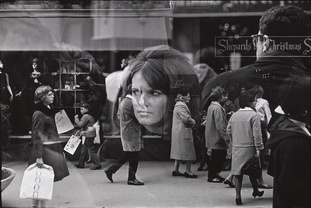
Photo Analysis
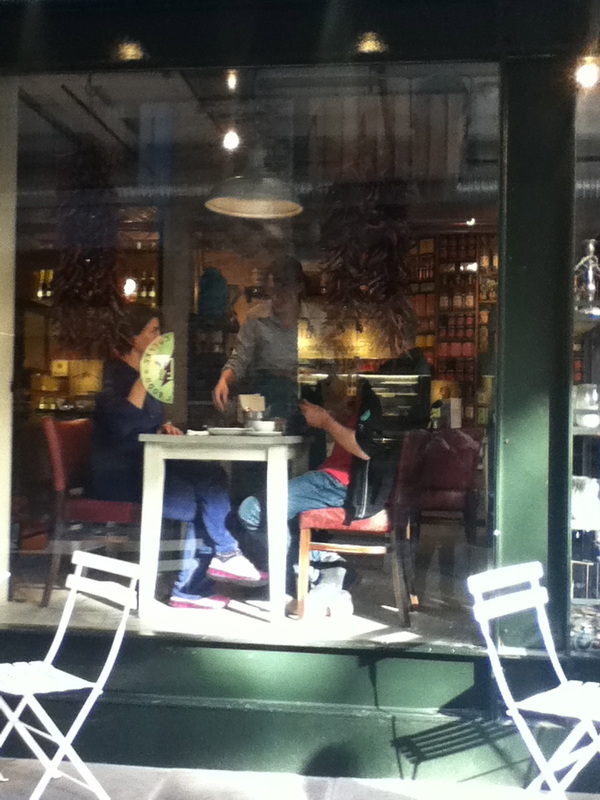
This is one of Harry Callahan's most popular images, of a girls reflection layered on to another image which gives it a much better affect then just a single image. Also it looks as if Harry Callahan has taken the picture straight on, this normally makes the image look quite boring but because there is quite a lot going on in this image and it is quite busy it doesn't really matter so much. Also by the picture being in black and white it gives it a better effect instead of being in colour, also by the picture being taken in black and white it gives it more of an olden days feel to it.
This is one of Harry Callahan's most popular images, of a girls reflection layered on to another image which gives it a much better affect then just a single image. Also it looks as if Harry Callahan has taken the picture straight on, this normally makes the image look quite boring but because there is quite a lot going on in this image and it is quite busy it doesn't really matter so much. Also by the picture being in black and white it gives it a better effect instead of being in colour, also by the picture being taken in black and white it gives it more of an olden days feel to it.
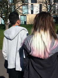
On Monday the 24th me and my photography class went to the Tate Modern in London, we see amazing images taken by some of the worlds most famous street photographer such as Harry Callahan. I found it quite hard to take pictures of random people on the street because you didn't lnow them at all and you had to get right in there face to make it real street photography and capture people in there every day life, we walked through a market to get to the tate so we had quite a bit of time to take photo's of different people doing different things.


|
|
|
William Eggleston
William was born in Memphis Tennessee and raised in sumner, Mississippi. His father was an engineer and his mother was the daughter of a prominent local judge. As a boy Eggleston was very musical and artistic he enjoyed playing the piano and drawing. From an early age, he was also drawn to visual media and reportedly enjoyed buying postcards and cutting out pictures from magazines. From the age of 15 William was sent to the webb school, a boarding establishment, Eggleston later recalled a few found memories of the school Telling a reporter "It had quite unuaual routine to 'Build character' i never knew what that was surpossed to mean it was so callous and dumb. It was the kind of place where it was considered effeminate to like music and painting ."
|
|


After taking my own images it made me think more about how I was going to layout my photo's. I think that using the rulr of thirds makes your photo's looks neater and makes the layout look better and clearer. I think that it is easy to spot if someone has based there photo on using the the rule of thirds.
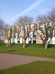
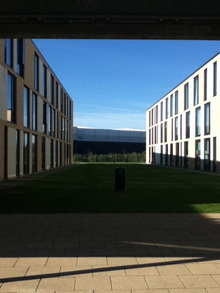
I think that this is my best image because, you can clearly see that I have used the rule of thirds because of the three tree's, also the centre tree is just about in the middle of the image because I used a grid on my camera. Also the main element's in the photo is the tree's and the building behind the tree's. Also the angle isn't straight, it is at a side angle which also helps it fit into the grid to make it look better and the elements look cleared within the composition. 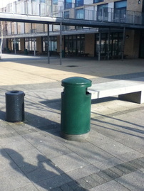
|
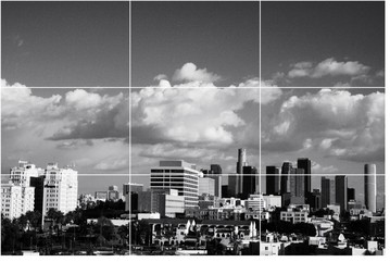
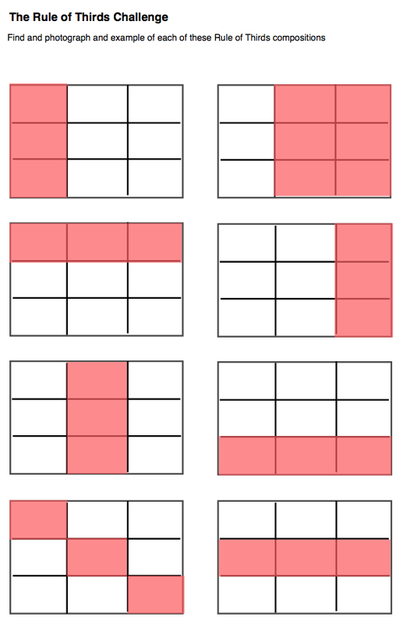
In the rule of thirds there is an imaginary grid, with two horizontal lines and two vertical lines, making three columns and three rows and there being 9 boxes. The boxes make either an object / person central. Important compositional elements and leading lines are placed on or near an imaginary line and where the lines intersect. For example the image that I have chosen for an example the photographer has used the grid and put the city sky like in three of the boxes at the bottom, this is one way that the rule of thirds can be used.
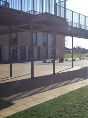
This is one of my least favourite images that I took because it is quite plain and simple because there is just two bins and a bench. To make it look more exciting and engage the audience more I could of either edited the image to look more interesting for example mirroring the image or even putting a colour effect on it, either black and white or even an effect that changed the colours that are originally in the image or put someone in the image to create a clearer rule of thirds. |
DiagonalThe idea for this challenge comes from Eric Kim's great street photography site. Street photographs are often about dramatic situations or view points. Drama is created in pictures in lots of ways but using strong diagonal lines is one technique often used by street photographers. The picture I have as an example is by the great Henri Cartier- Bresson. This photo is my favourite photo that I took because it shows clearly what the theme of the image is. Also there is nothing else to distract you from the main aspect of the image, which is the two girls feet, the girls feet are very central in the image. Further more, the elements in the image are quite neat and are very central, it could be seen as quite plain and simple but the only reason for this is because I didn't want there to be many objects to distract from the purpose of the image. |
These are some of the images that I took around my school, the theme of these photo's were diagonals, I think that it is quite obvious to see. All of my images include some sort of object that is diagonal. I thought that this was a really easy theme because there are diagonals every where, either they are already diagonal or we could create diagonals easily. In most of my images there is a good depth of field in each. 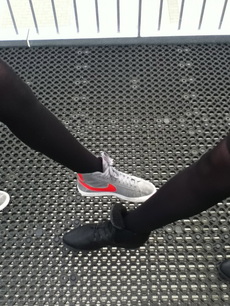
|
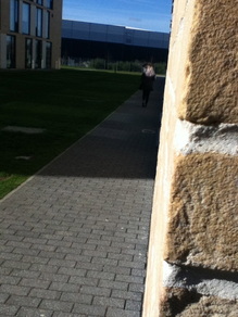
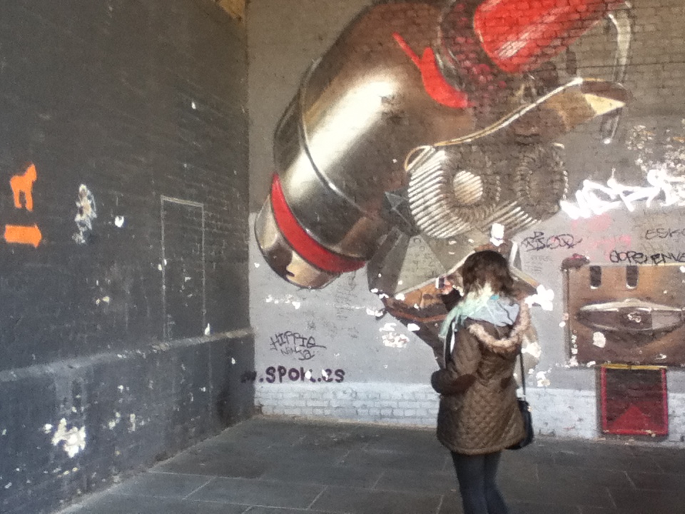
This image also fits into one of the red zones. As the wall is taking up quite a substantial amount of the image and would fit into the red zone that is on the far right and straight down. The only way that it doesn't fit into the red zone is because of the girl walking down the path, I like this image as there is direct sunlight hitting the side of the wall where the camera is and further down there is a lot of shade from the buildings giving a nice effect.
|
This image is a very randomly laid out image and our task was to make sure that the images we took didn't fit into the red areas of the grids on the left.This image was successful in not fitting into the red areas as it is a very randomly laid out image that quite obviously has had no thought go into it.
This photo was quite successful as there isn't just one aspect capturing your attention, it's everything as it is quite busy. However the one thing that captured my attention as soon as I looked at this image was the links as it runs through the centre of the image. Also the challenge was to take photo's that did fit into the red parts of the rule of thirds and I think that it does go into the red area slightly, the red zone that is across the top, this image fits in there because of the links.
Finally, this image again fits into the last grid with the red zone going through the middle because of the two buildings either side and the singular bin in the middle. I found this image very effective because of the shadows that are in the image, easily showing where the sun is rising. The sun has created an unusual shadow because of the links and the buildings
|
