|
Erwin Wurm - All of his work is based around something very unusual and something you would never imagine you'll see, these three images are all very similar however they all caught my attention because all of the images are in a plain room so your attention automatically goes straight to the people that are centre of the image. The image i most like is of the girl and the mop next to her because it is most definitely not something you will see everyday also i like how erwin has stood the broom up and stood the girl next to it to show if humans do the same a an object it does look a bit absurd.
Experiment 1 |
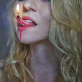
I really like how the artist has done this, having the girls tongue look like wax dripping and the tip of her tongue being the flame. I also like how it was framed, instead of having the whole of the girls face its just of the bottom of her face, her hair and her neck which centres her tongue and the flame however the one thing that i would change is having that much of her hair in the image and instead they could of had it all to the side, all behind her or tied up which would of drawn the audience straight to the mouth, the hair being there is fairly distracting. |


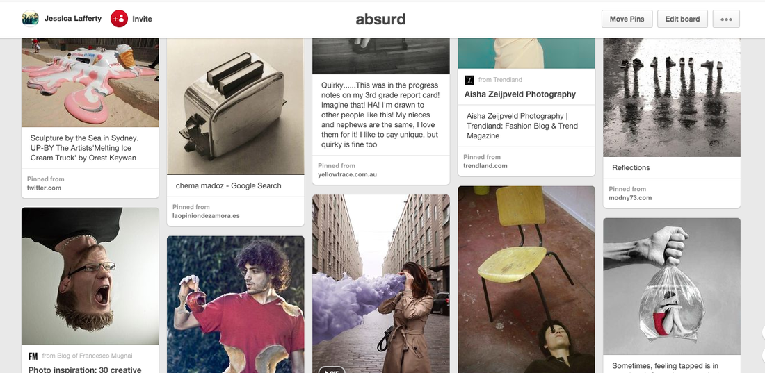
These are just a few images I took last week to go with the theme absurd, my favourite ones are the ones of the masks and having people wear them hiding behind posts and looking into a mirror giving the images quite a creepy affect. The props came in handy whilst taking these images as it made them look very unusual, different,weird and something most people wouldn't imagine being a photo. My favourite image has to be of the boy looking into a mirror, because it is very unusual image which could also look quite creepy.
Experiment 2


These i took at home, it was very tricky to think of some idea's of what to do however i thought of these two ideas which were instead of having food on a plate swap it round and have a book on the plate to make it seem as if the book was the food also on the second image again i swapped over things, instead of having the duvet on a bed i put it in the bath, most people would look at these images and think that it was a crazy idea which is what i was going for i had an affect on whilst taking these images called process, it is a green toned effect which i really like and thought it would add a good effect on to the images instead of them being plain and simple. I added the extra six a bit later as i didn't have many idea's of what to do however after looking at some examples of absurd images i came up with all sorts of things for example having it look as if i was pouring out pencils and ironing bread. I enjoyed taking these images as i had lots of ideas and i could put them into action no matter how unusual and random they all were, also i could create all the images by using appliances at home.
Experiment 3: Hiding


I really enjoyed taking these few images because is was quite tricky of what to do in the images however we could do whatever looked interesting so again we got a few props to make our images look really different and unusual for example the masks and wet floor signs came in handy as we could use them to covering peoples faces as this part of the unit was all about hiding for example covering peoples faces or the top half of someones body or the whole of someone. My favourite image is of three people in a corridor it is my favourite image because the three girls are covering there faces in different ways, one girl with a mask another with a hood over there face and another girl holding up a jacket.
Experiment 4: Signs
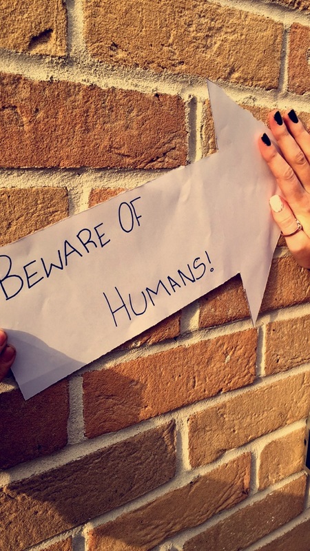


I focused my images on absurd signs this time round because there is a lot you can do with signs to make a certain object or another sign look absurd for example the ladies toilet sign, as it was orange i stuck another sign on top of it to say 'no orange signs beyond this point' just a small sign makes this sign absurd as it is contradicting itself by having an orange sign with a sign on top saying no orange signs. in most of these images i have done opposites for example the image of the railings on the stairs i had post it notes saying slide don't walk insinuating people slide down the railings, the stairs cannot be used.
Experiment 5: Signs


This is my second experiment using signs, I enjoyed using signs as you could take any image and they would sound absurd or look absurd for example 'warning this is a school!' it is absurd as when people look around they will obviously be able to see that they are in a school and won't need a sign telling them. Also the first image having a sign stuck on to a step saying 'watch your step' is contradicting itself as when people are walking up a set or stairs they obviously will not need a sign telling them to watch there step.
Experiment 6


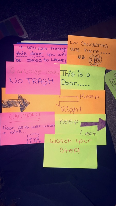


Within these images I thought more about the background of my images as the background always plays an important part,for example in the last image you can clearly see that the background is of a white wooden door and the post it note is clearly being quite sarcastic in what it says, 'warning this is a door...'and by having a wider range in the image it comes across more absurd.
WWW: I think these images went fairly well because they all relate to my theme 'absurd'. Also there is a good composition in some of the images for example the 4th and 6th image both have quite a good contrast because where the post it notes are it is quite light and it goes sightly darker and round it by the edges of the image.
EBI: In some of the images they are not as good as some of my other images for example the second and third images are very random and don't really link to the absurd theme, also in the second image the lighting is very bad to the point you can't actually see what the writing says also the background of the image isn't to good either because it is quite bright which makes it harder to see the writing.
Experiment 7


These are a few images took the other day and instead of using signs this time I used a mirror as I think it gives the images a better effect, you can sit the mirror any where and if you just change the angles it can become an absurd image, but sometimes its not obviously absurd and it can look normal. I enjoyed taking these images because I could let my mind wonder and put my thoughts of what I would want to do into action. WWW: Things that went well in all of these images is the placing of the mirror, in each of the images where I used the mirror they were all placed in similar place but each had a different reflection. In the 5th image I think it had a really good reflection and had a good placing, it is not obvious as to where it is but it is in between the girls legs, it had a good reflection because it had her leg her shoed and skirt reflected perfectly also the grass was the back ground of the image as well as the reflection so it blends into the background. In the last three i didn't use the mirror however I still think they are good images because they relate to the theme absurd.
EBI: In some of the images there are things that could distract the audience from the purpose of the image fro example in the 4th image you can see some girls in the corner of the image so to improve I could crop them out so that the main focus it on the girl and the mirror. Also in the second image the girl had headphones dangling on the skirt which looks quite distracting because it isn't in any of the other images.
EBI: In some of the images there are things that could distract the audience from the purpose of the image fro example in the 4th image you can see some girls in the corner of the image so to improve I could crop them out so that the main focus it on the girl and the mirror. Also in the second image the girl had headphones dangling on the skirt which looks quite distracting because it isn't in any of the other images.
Experiment 8


WWW: In these images the main things that i think went well is the placing of the mirror, in each image there is a reflection that works for example in the fifth image I got someone to hold the mirror above there heads to get a reflection of the sky I took this from above on the links to get a better angle on the mirror and made sure it was is focus.
EBI: These images would of been better if I had them in focus because it makes them look messy and not good quality, for example, the fourth image is really out of focus where the legs are also by the girls hair so where the reflection is everything is out of focus. To make this better I could of re-taken the image so it looks better and to show that I refined it.
EBI: These images would of been better if I had them in focus because it makes them look messy and not good quality, for example, the fourth image is really out of focus where the legs are also by the girls hair so where the reflection is everything is out of focus. To make this better I could of re-taken the image so it looks better and to show that I refined it.
Experiment 9


Again like previous image I have used a mirror to create interesting and absurd images. I really enjoyed taking this few images as you can let your mind wonder and put all your ideas into action.
WWW: Things that went well are the angles that the mirror was being placed in each image, as I got a good reflection for example the 1st image of the brick wall it looks as if the person holding the mirror is holding a brick wall which I think is quite effective and can also capture someones attention as it is quite an absurd image. I carried on this throughout my images, for example in the rest of the images I have got the mirror sitting in a certain position to get a certain reflection like I did with the brick wall, I again got the same person to hold the mirror getting a reflection of the railing or of the brick bench I made sure that those things were the main focus of the image so I only had certain parts of the girl in the image for example the bottom half of her body or nothing at all and having just the mirror in the image covering the girl so it was the main focus.
EBI: These set of images would of been better if a had the same theme through out my images for example having the girl holding the mirror all through the images and had the others in a different set of images. Also I could of cropped out some pieces from some of the images to make sure that the reflection on the mirror was the main focus and there was nothing in the background that could distract people from the purpose of the image.
David Shrigley |
In each image there are signs each of them are quite unusual. In each image there is quite a nice depth of field, the signs are either in the centre of the image or completely to one side so you can see what is behind the signs so that the signs makes sense. If i did meet the artist, David Shrigley, I would ask him things such as why did her do the signs he did as they are very random and unusual, for example the first image of the lost pigeon is very strange because there are thousands and thousands of pigeons around and will never be able to find just one. |
Final Piece


These are the first set of images I took yesterday using one of the larger lights to create a sunrise effect as I wanted this to look like a school girl having an absurd breakfast using paper in a glass bottle to represent milk, orange paper to represent orange juice and buttons in a bowl to represent cereals. I am fairly happy with these images however I am still going to refine the images to make them look better so it has a more food like look, either breakfast or dinner. The thing that I thought needed improving most was the layout of the image and the lighting as the lights was quite bright and was fairly close to the table when she was sitting which made a shadow of the girl on the backdrop.
WWW: I liked how the girl was sitting and how she was placing her hands on the table and playing with the buttons to act as if it was a real dinner. Also the images are quite simple so there isn't to much going on to distract the audience from the purpose of the image.
EBI: The lighting was not so orange toned and a but further away from the subject of the image (the girl and the objects on the table). Also if the objects were more a like what I wanted then to be for example an actual mug to put the strips of paper in also a better bowl as the one I used was made of plastic and the audience is most probably going to be able to tell.


I have decided to use these four images as my final piece however I may still edit them slightly to improve them slightly. This is the refined version of my first set of images, I decided to re-take the images because I felt that there was room for improvement so I had the same student sit in the same position she was in from the previous set of images.
In these set of images I moved the light slightly further away then it was previously because in these images the lighting isn't directly shining on her face but is slightly pointing away giving it a better effect also I changed the depth of field, having a close up in some images and then slightly further away in the first two images to show the full image of the girl having dinner. To make this an absurd image instead of using real food I used some tape from a tape recorder also in the cup next to her I used thin strips of paper to represent a cup of milk. I have taken some risks by doing this specific subject of a girl eating dinner as some people could interpret it wrong thinking it could be something else.
WWW: The things that I think went best is the lighting, (which is want I wanted to change previously) as it is a lot lighter and more of a natural then the previous images as it was quite an orange based light that I used in the other images which didn't work how i wanted it to so i played around with different lights and the positioning of the light to get it how I wanted.
EBI: Although these are my refined images I still think there is room for improvement for example maybe having a slightly different background instead of the black one to make it more realistic. These images were mainly inspired by Csilla Klenyaszki as most of her work is based on everyday things and she has changed them slightly to git the theme absurd.


I continued the theme of what I was doing previously of doing a morning routine of a school girl however instead of using normal objects I used objects that would not be used in a morning routine. In these set of images it was a girl doing her make up however instead of using actual make up I changed it and got her to use things such as a fork for mascara, a rubber for lipstick and blue paint for foundation which obviously would never actually be used.
WWW: I was quite pleased with how these images turned out, specifically with the lighting because again it was quite bright.
WWW: I was quite pleased with how these images turned out, specifically with the lighting because again it was quite bright.
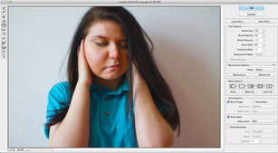
I took a few images of different people putting their hands in different positioning on their faces so I had a blank canvas to edit on, for example, I chose this image because I could edit her face in any way by either merging it with another image or just editing her face using the tools in photoshop like I did in this example, I used the bloat tool to make one her cheeks larger also I used an effect to make the colour of the image slightly different it is now quite orange based.
Final Piece


Both of these images link together as I based them both on a morning routine of a girl. The first image I took of the girl I was fairly happy with however I thought that there was room for improvement so I re-took all of the images and changed the lighting that I used so it was not as orange based as the first light but instead it was more white, I was a lot more happier with the refined images but instead of having four images I have cut it down to one and edited them in photoshop using a black and white effect and a water colour effect to make it look more like a painting then an image. In the second image I only had to take one set of images because I liked how they turned out however instead of using all twelve images for my final piece as there is to many for a final piece, I picked out the image that I thought was the best and done what I done to the pervious image which was a black and white effect then add watercolour, there were many effects however I found that water colour worked best as it didn't darken the images to much and I like how it had a painting like effect on them.
